Do you need some fresh inspiration for corporate stage design? Is it time you discovered a new approach for that annual conference or general session? Yes? Then you’re in luck! We’ve searched around the globe to put together a list of creative corporate stage design ideas worth a look! Simply scroll through for images and tips to get the inspiration flowing for your next corporate event.
1. IBM Impact Conference
Source: Encore Event Technologies
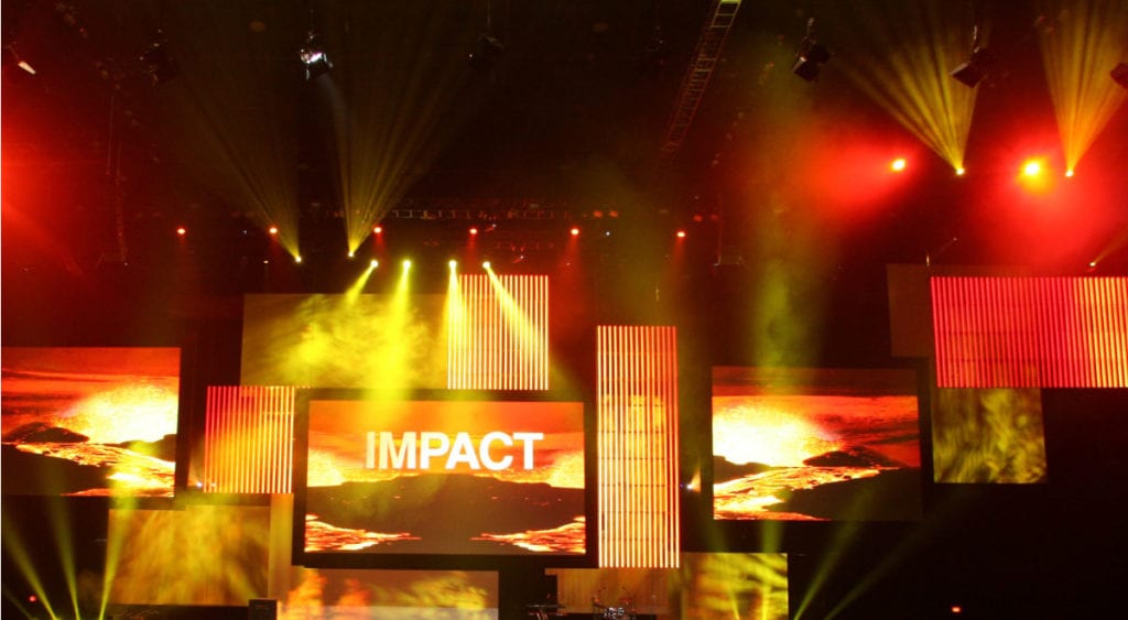
With some 18,000 people attending the IBM Impact Conference, every aspect of the event must engage huge amounts of people. That’s why event organizers chose to create a multi-dimensional set with a series of screens layered across the stage. Organizers assigned each conference topic a color. So, with this creative corporate stage design, it was possible to transform the set with lighting and on-screen imagery in the designated color for each topic. This is high-energy multimedia at its best!
2. AT&T Developer Summit
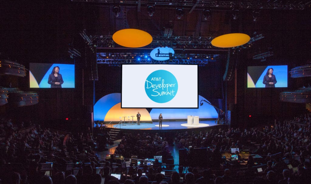
Source: Freeman
What happens when a big name needs to reinforce their industry stature? They turn to eventprofs to overhaul their summit with more uniformed branding and an emphasis on innovation. That’s what Freeman did for the AT&T Developer Summit. And the result? A huge impact.
Consistency was the priority here, as you can see from their impressive corporate stage design. Everything from the curved stage to the circular mats, backdrop and ceiling fixtures ties to the AT&T Developer Summit logo featured on the screen. The right balance of bold color energizes, without over-stimulating the senses.
3. Life Sciences Trainers & Educators Network Annual Conference
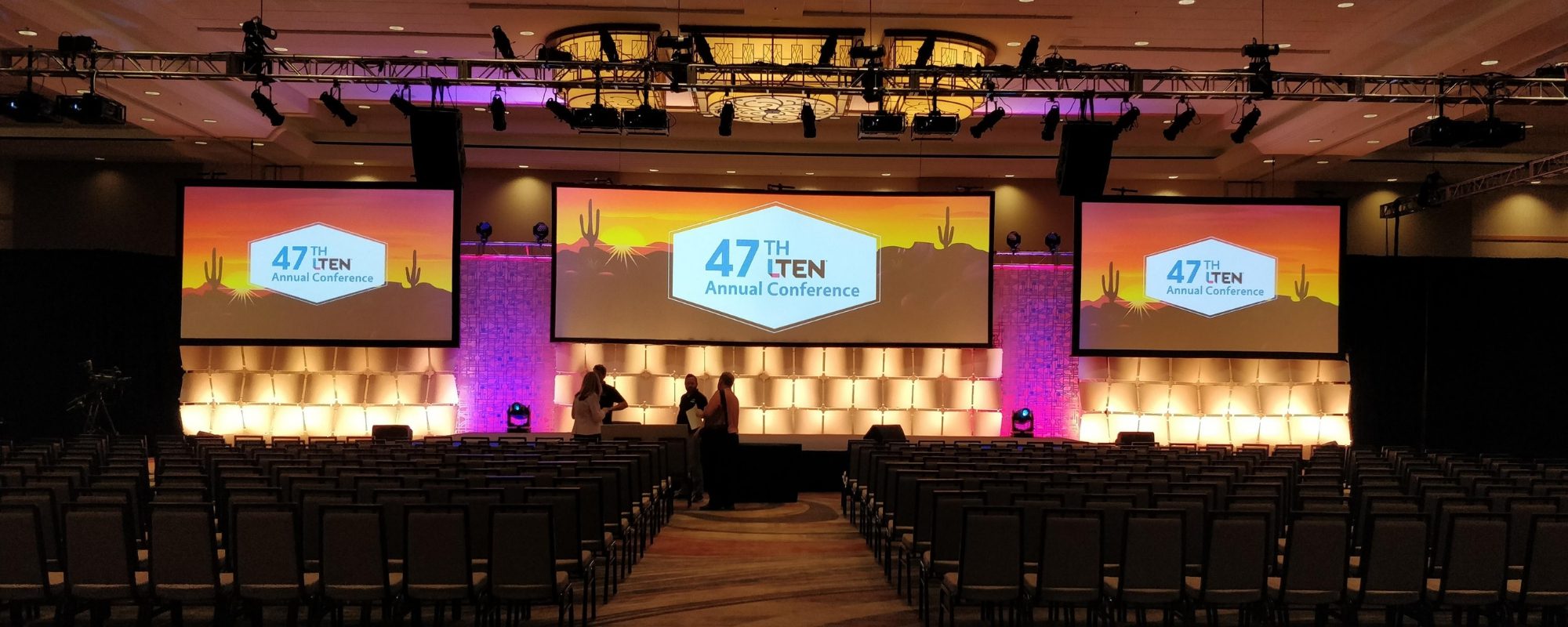
For a corporate stage design reflective of conference themes, look no further than the Life Sciences Trainers and Educators Network Annual Conference. Aspects of the Arizona landscape and LTEN’s technology theme were the inspiration for this beautiful stage set, because of the event’s location.
Layered backdrop elements like waved panels combined to create a representation of the Grand Canyon. The set also played with different textures and patterns via circuitry panels and used a triple-wide screen for presentations because Arizona is a hub for growing tech. Color washes lit the stage and intense color saturation emphasized the many textures. Blues, pinks and yellows created a sunset desert palette that was nothing less than stunning.
4. Forbes Women’s Summit
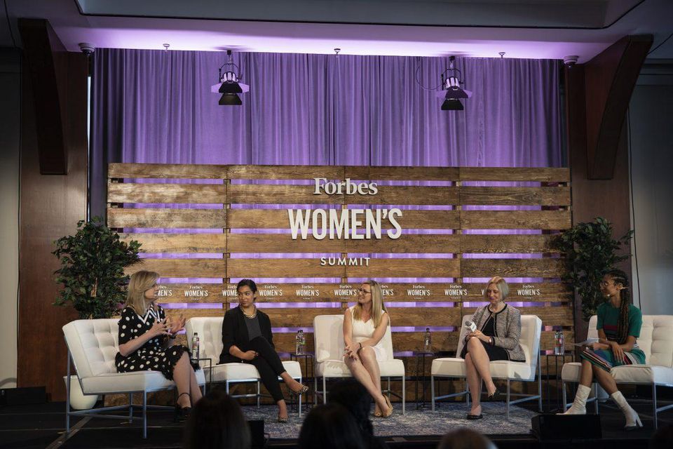
Source: Forbes
At the Forbes Women’s Summit, four C-suite leaders took part in a panel titled “The Builders: Shaping the Future of Work Now.” Intentional or not, the backdrop of timber paneling was entirely fitting for the name of this panel. The rustic backdrop combined with contemporary furniture created a clean but comfortable presence, while the timber paneling and greenery have an eco-friendly feel.
You don’t notice the curtains behind the timber at first, but the purple lighting adds a touch of color and a warm glow to the staging, without overshadowing the panel of speakers. This isn’t a highly-technical corporate stage design, but it’s nonetheless very effective. The perfect inspiration if you’re looking for cost-effective staging for your next corporate event.
Source: K&A International Co., Ltd.
5. MariaDB 17 Tech Conference
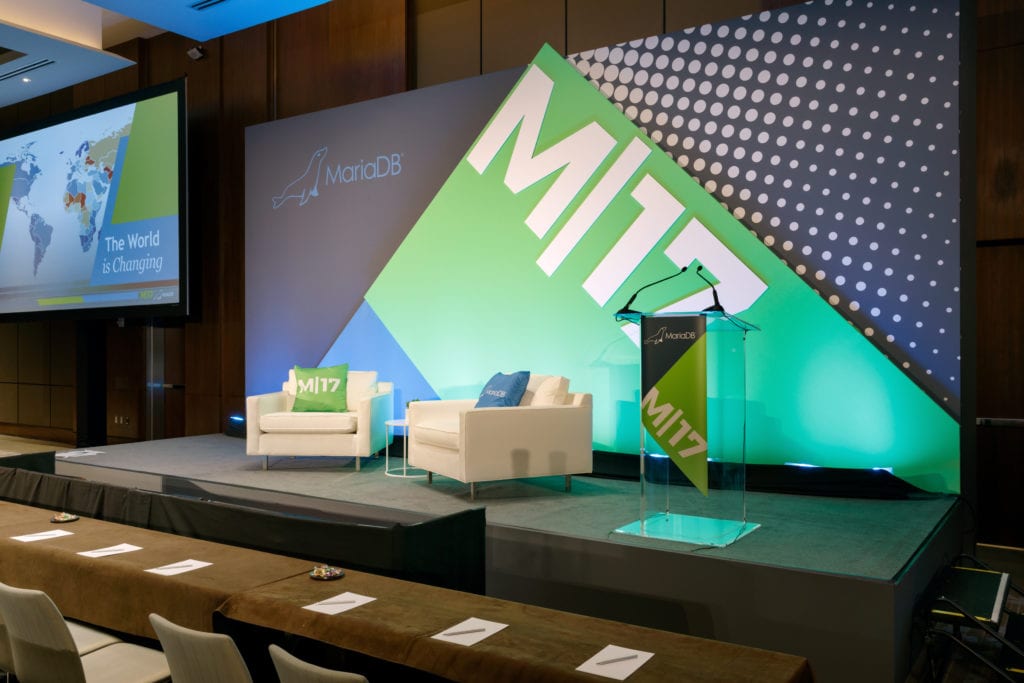
Source: Visual Journal courtesy of Moniker
Consistent branding and clean lines were vital to an elevated conference experience at MDB 17 in New York. Layering bold colors and patterns created an aesthetically-pleasing corporate design that also had a sense of depth. A transparent speaker podium with a branded banner was the ideal choice to not detract from the bold backdrop.
A screen positioned to the side of the stage displayed content while allowing the speakers to be front and center. Consistency certainly doesn’t mean dull here. What stands out overall is a bright and uplifting vibe to energize attendees.
6. Pivot Summit
Source: Microhire
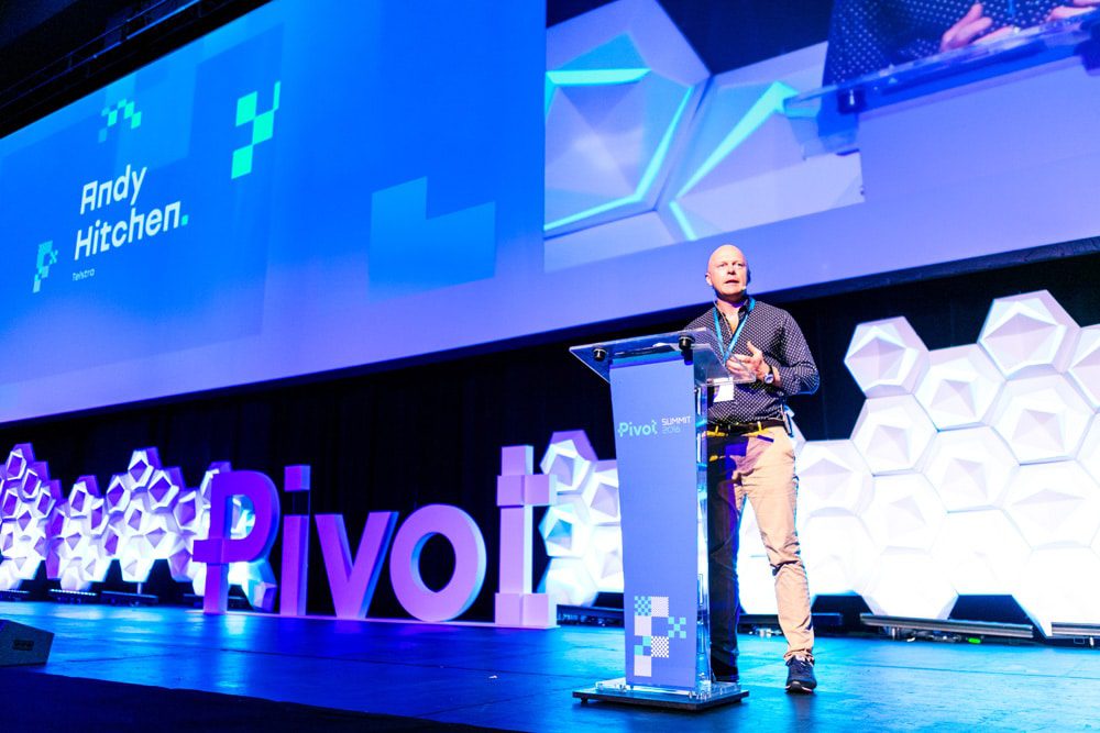
The Pivot Summit is a tech-centric business event in Geelong, Australia. So, the decorative staged features used here are a good choice. They resemble building blocks that bring to mind Tetris or molecules. Aside from unique shapes, a bold 3D logo and a color wash do wonders to bring this staging to life. These are a great foundation to use whenever you’re planning a corporate event.
Keeping the decorative features white makes sense for creating a contrast between them and the colored lighting. Positioning the widescreen above the stage, rather than to the side helps to continue drawing the eye of the audience to the front and center (whether they are sitting close by or towards the back.)
7. TTI Success Insights Conference
The TTI Success Insights Conference needed to change-up how their event presented, but it meant getting creative. It was essential to be able to easily reconfigure the one space to hold both general and breakout sessions. We also replicated the appearance of the main session staging for the breakout sessions. Attendees appreciated the consistency of quality as they moved between sessions and it helped to keep their energy up.
Panels of scenic fabrication placed at intervals between projection screens helped maintain that consistency, with easy mobility for the room changes. A blue light wash over the backdrop created a great work environment for attendees. The feel was classy but also uplifted.
8. In Good Company Conference
Now we turn to a smaller, but no less beautiful corporate stage design, for the In Good Company Conference. The overall design combines living room-like comfort with elements of nature – a breath of fresh air. The simple backdrop in all-white highlights the conference without any distraction.
Beautiful greenery disguises the front and sides of the black stage and helps to create a sense of happiness and balance. The furniture invokes a sense of intimacy, which is a perfect tie into both the conference name and purpose – for creative entrepreneurs who are women and mothers to connect with each other.
9. Forca Dimec 2018
You’re only limited by your imagination when it comes to creative temporary staging. A perfect example is this corporate event in Brazil. Two purpose-built brick walls from EverBlock flanked a curved widescreen for video projection mapping. Because the blocks can be taken apart and rebuilt for the next event or even to create something entirely new, they’re essentially a green building element. They’re also a great option for adding a sense of playfulness to a corporate event which might otherwise run the risk of appearing too serious.
We love that the blocks add color, texture and interest. But it’s also about the contrast created between technology and physical, tangible objects.
10. VOICE Summit 2018
At this tech event, 3D decorative panels with a resemblance to computer motherboards were used. To highlight the creative corporate stage design further, the fabric backdrop, stage and even the attendee furniture are all in black.
3D lettering is always a favorite because of its tangible nature. Also, because it was white, it could be projected onto for color changes throughout the event. Large screens were set to the side of each stage for optimum viewing, without detracting from the stage design.
11. Ministry of Education Event – Republic of Maldives
As this event was for the announcement of a pledge fulfillment for a free preschool initiative, the child-like feel to the staging was the perfect choice.
One of the most creative features at this event were the playful lighting projections onto the paneled ceiling. These projections were in the same colors as the bold stage backdrop panels. Because of the positioning of the panels, along with bold imagery and a small amount of text, it made them appear like pages in a children’s book.
12. Dubai Islamic Bank Gala Dinner
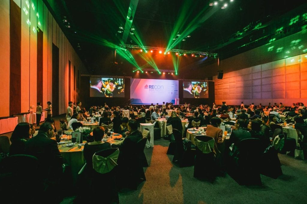
This event makes our list because it’s the perfect example of creating a theme with corporate stage design. Of course, magnificence and opulence are just right for a bank’s gala dinner! Lighting, screens and 3D objects were all used as features that, when combined, resembled a galaxy with a night sky and a central planet with rings.
The brilliant lighting across each step reflects that of the rings, while also directing attention to the stage. We’re in awe of those lighting beams projecting outward from the stage. They create a feeling of inclusivity – that attendees are really part of what is happening on stage.
13. Microsoft EDU Keynote
If you’re looking for something completely different, with a live, off-the-cuff feel, then this is the one for you! After all, who says you must do what everyone else is doing?
During a Microsoft EDU keynote, illustrator Hyesu Lee created an illustration using the Microsoft Surface Pro. It was shown live on a screen which became the backdrop for the session. Because of this colorful and attention-grabbing backdrop, it was essential that the rest of the corporate stage design didn’t compete for the audience’s attention.
14. YAHOO! Partner Day at Levi’s Stadium
The goal for this corporate stage design was to wow the startup’s super-users, who were known for their appreciation of good design. In other words, the set needed to be Insta-worthy! Here, we see that sleek and stylish, rather than showy was more appropriate for the audience. And a sense of symmetry was essential too.
Staggered panels added depth, while still maintaining clean lines. The panels were also subtly shaded in different colors. A light stage is a nice change up from the many black and dark grey rental decks we see.
15. UP Global
Source: designworklife courtesy of Moniker
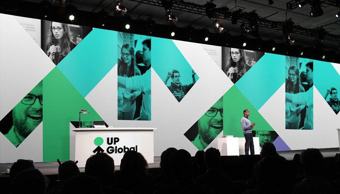
Don’t make the mistake of thinking “corporate” must be “impersonal”. UP Global showed an essential human element at their corporate event by using people’s images as part of their stage backdrop. After all, this is in line with UP Global’s desire to support entrepreneurial communities. We think obvious references like these can be more effective than the obscure. When you plan your next corporate event, think about the best way you can form a connection with attendees – not just wow them.
16. Turner Internal Meeting
Source: ATOMIC
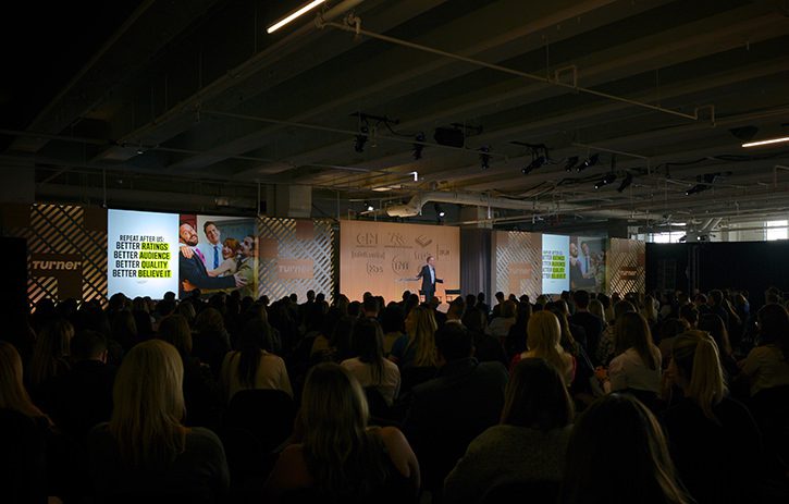
The Turner Internal Meeting showcased completely different corporate stage design elements than our other list entries. A stand-out feature was their custom-built wood hero wall. Comb SuperWall was then positioned between the hero wall and the projection screens which were used to display both imagery and content. Notably, sections of Comb SuperWall were used around the rest of the venue too, to imitate columns for example.
With eye-catching features like these, it’s essential to then create some balance. And so, a clear podium and grey stage let the backdrop take the focus.
17. PARP at CeBIT ICT fair in Hannover
Source: Poland at CeBIT
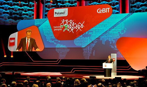
For the largest ICT fair in the world, the high-tech and sleek staging we saw at Hannover was the perfect fit. The screens on stage function both as practical items for displaying content and decorative elements, thanks to unique shapes and their overlapping layout. Color also plays an important role. The red and orange hues are on-brand, while blues create some relief. A variety of lighting helps to create a dramatic multi-dimensional feel to the staging.
18. TOBY Awards 2009 for BOMA
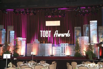
Source: Smart Meetings, courtesy of Bravo Productions
What do you do when you need to create a beautiful awards dinner on a budget? You create an eco-friendly and reusable corporate stage design! For the client, Building Owners and Managers Association International (BOMA), event sponsors created a city skyline out of timber to build into a set. They added to the effect by renting trees indigenous to Southern California and using a gobo crafted into a representation of skyscraper windows to project light onto the set.
LED lighting was chosen for its energy efficiency, to continue the theme of eco-friendly design. But, it also allowed for more color changes throughout the event and therefore, a more dynamic corporate stage design.
Bonus: Campground Breakout Sessions at Salesforce’s Annual Dreamforce
Dreamforce is an absolute force (no pun intended) in the CRM conference world. Held annually in San Francisco, Dreamforce rises like a Kaiju from the sea in the Bay Area. It draws over 171,000 attendees and has over 2000 breakout sessions over a week. While their main stage is impressive, the design of the Campground breakouts is what we like the best. Campground is a marketplace for various Salesforce vendors that offer integrations into the Salesforce CRM. The design feels like a campground for techies. By displaying their respective apps, vendors allow attendees to learn and test their software. The overall look is much like a theme park and helps frame the vendors’ projects in a fun and exciting way instead of the stuffy air of a breakout room.


