How often do you wonder what’s the best video format for events? What may strike as a very simple matter, actually has quite a bit of juice to be squeezed! Choosing the best video format for events can get quite confusing, and here at Endless Events, we’ve kept our ears and eyes wide open.
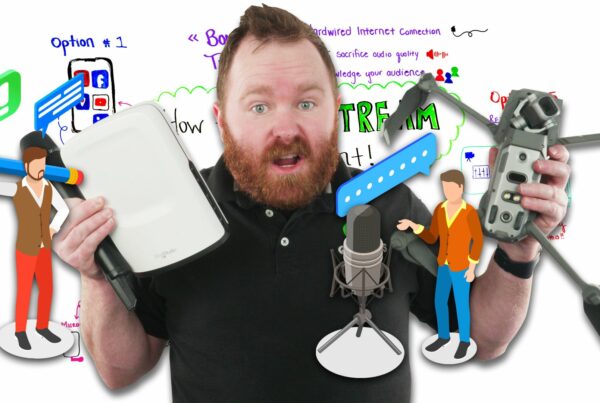
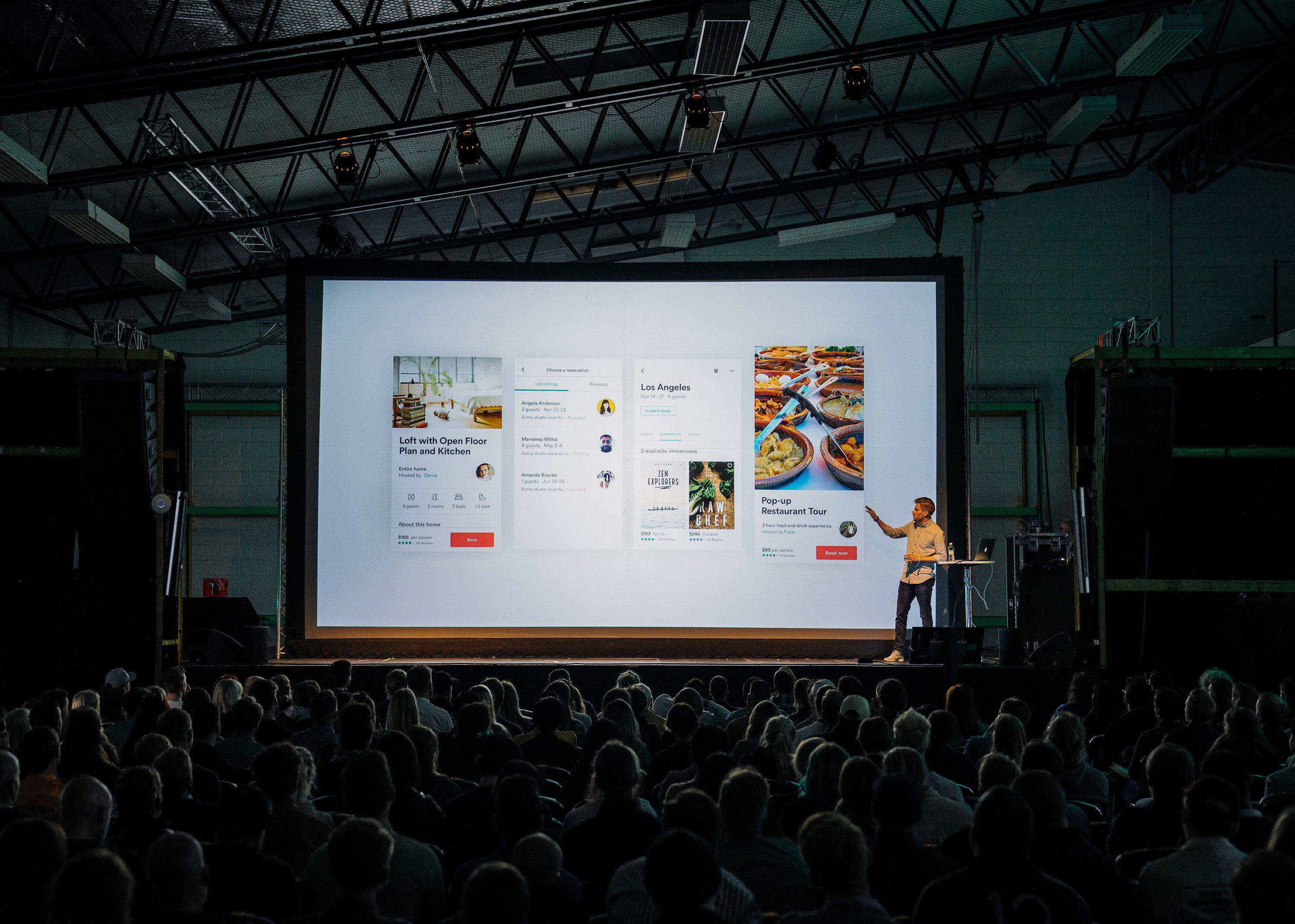
It’s a very common question, and it’s more than time it gets a valid answer! Join Will Curran for a brand new Whiteboard Wednesday, where he walks us through the sneaky issue of the best video format for events.
The Best Video Format For Events
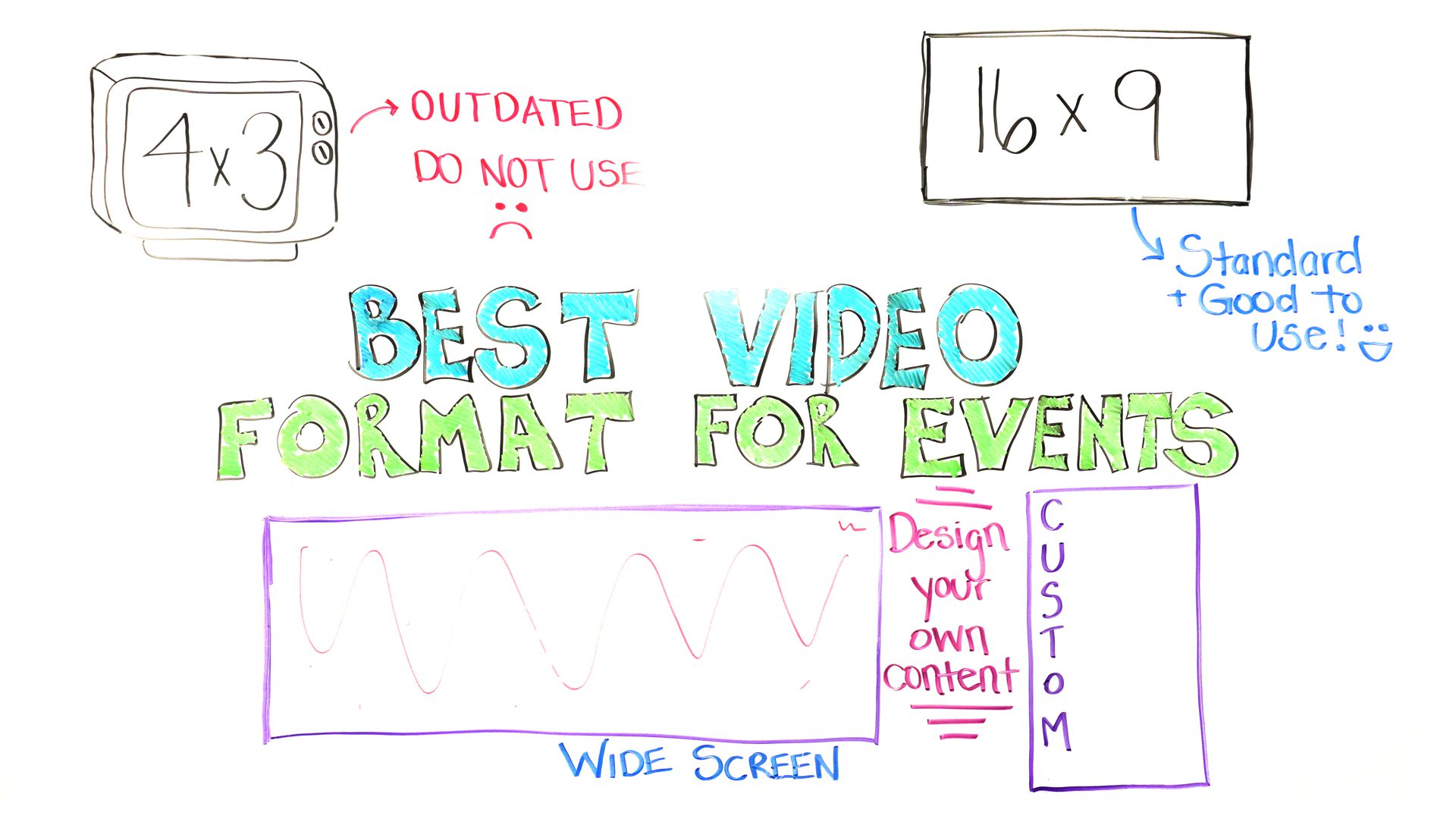
When it comes to your video format. We’re obviously talking mainly about like screen format, as well. And you know, what sort of file size you’re going to be looking at. So, whether it’s a dot mp4, or what resolution 4K versus HD. Not as important here, as well. Just mainly the aspect ratio that we’re talking about. Whenever you talk about the ratio, we’re talking about the sizing of everything. So, back in the day, if you guys remember those CRT TVs that we used to have with the big tubes in the background, and basically anybody younger than me is pretty much like, “What’s that?”. We remember that the aspect ratio for those screens was what’s known as four by three. It looked a little bit more square, basically a square sized screen. We’re all used to that, right? That’s where our content was. But as you’ve noticed, over the years our TVs have shifted. They’ve become more widescreen, as well. Well, that’s a different type of aspect ratio, and we’re going to talk about that.
The Modern Times Aspect Ratio
The important thing for you to know, though. If anyone ever designs a PowerPoint, or a video, and make it four by three, that’s a big sad-face right there. We do not want to have that, you do not want four by three content. That is old school. That’s like running dial-up, oh my gosh. We do not want four by three content anymore. In fact, most rental house AV companies don’t even carry four by three screens anymore, so therefore it ends up being more expensive for you to do it that way. Instead, what you want to be using is 16 by 9, this widescreen on here that we have on here. Very, very common whenever you’re doing your screens. So make sure when you’re telling your presenters, never use four by three, always 16 by 9. What usually a little bit less tech-savvy are using four by three, almost everyone knows to use 16 by 9 now. Good to go.
Pick And Choose
So that’s the kind of the basics stuff, right? When it comes to knowing which one not to use, and which one to use. When it comes to it. And we’re talking about very simple projection screens. For example, they make screens that are … lots of screens that are 16 by 9 now. And they still make some four-by-three screens. But when we start going beyond that, and you’re like, “Man, we do the two screens on either side. And we’re ready for the next thing. The thing that’s going to make our audience super engaged the entire time.” A lot of people love to get into the custom formatted screens. Things like, for example, a three-by-one aspect ratio screen. For every three feet, you go this way, you’re going one foot down this way, for example. So this might be something like a 30-foot by 10-foot screen, or something like a 60 by 20-foot screen, for example. Just a lot of different options when it comes to that. We even see things like 40-foot by 10-foot screens, 50 foot by 10-foot screens. I mean, pretty much you can take any size and decide what you want it to look like.
Don’t Waste Space
But, you also see unique things for example, instead of doing your screens horizontally, doing 16 by 9, you might be doing something like 9 by 16. Or you might do, you know, a five foot by 20 foot sized screen. All these custom options. Obviously, when it comes to these sort of things, you’re getting kind of into projector blending, a little bit of light projection mapping stuff when it comes to this. So that’s just something to be aware of. But, before you go out there and say, yep this is what I want, I saw it as a conference, we have to have it at our event. You need to be aware of what comes with that. Because when a four by three, 16 by 9, it’s really easy, right? You make a PowerPoint, PowerPoint has a template for it, and boom, you can figure out that way.
You might be thinking to yourself, “Well yeah, we’ll just do a three by one aspect ratio screen. And we’ll just tell our presenters to make their PowerPoints in that aspect ratio.” Well, it doesn’t always work that way. One thing that ends up happening, is the presenter’s usually don’t because it’s a weird aspect ratio, so something doesn’t quite fit in. So then the next thing that kind of happens is, our clients say, “Yeah, we want this, we’re going to pay for it, we sign off on it.” And we say, “Okay cool. What are you doing for content?” And they say, “Well we just have a bunch of presentation in 16 by 9.” So what ends up happening, is you take that 16 by 9 screen, and you put it in the middle. Look at all this wasted space over here on the right-hand side. Like, you just … why have all this screen and pay for all this extra money, for example to use multiple projectors, to make this look good, and everything like that. When you’re just going to waste this space. Well then usually we hear, well why don’t we put, you know, our logo on either side, right? Yeah, still okay. Why not just do it with a banner or a Gobo, or something like that. Why you going to spend that money to do it?
So, what I wanted to recommend to you guys, is as we start to do this, is to … some unique options that you can do when you’re doing these custom contents, and how to do it the right way. And how to bring unique items into it. So, let’s start talking about the ultra-widescreen, to start off with. Some common examples of what we see in and that works really well. Especially if you’re forced into this. For example, if you’re using a keynote speaker, they don’t want to make custom content for this sized screen, they just plan to have 16 by 9. Well the best thing you can do at that point, is taking a 16 by 9 presentation and place it off to the side. And put something else right next to it, another 16 by 9 screen, you know. Add some borders, designs, and things like that. You know, maybe some sponsor logos at the bottom. Maybe your logo at the top right. That sort of stuff.
Know You’re Options And Switch It Up
However, what’s cool is that, not only can you show a presentation on this kind of screen within a screen, a picture in a picture. But you can show something else over, as well, as I was talking about. So what this number two might be is, for example, it could be a camera angle. So like, for example, what we usually like to see is, usually we put … when we do these triple wide screens, we put another screen on either side, that does cameras. This is just content. But let’s say, for example, you’re doing a cooking event, which we’ve done before. And what we did is we put, you know, the PowerPoint over here and then they’re doing demonstrations, so we put a constant top-down view right next to them, which is really cool. Again, utilizing this screen, and when you’re able to switch. Or for example, you could put one camera on this one, second camera on this one. Pretty cool, again like, picture and pictures options available to you when you’re doing these screen formats.
However, one thing that I’ve seen that would also be really successful is you have the PowerPoint over here, and then you put an audience engagement software over here on the right-hand side. For example, it could be something like a text to screen software, or a Q&A software, or a polling software. You could put that over here so as they’re showing their PowerPoint, the question and answers, and polls are pulling up here on the second screen the entire time. Pretty cool, right? So then that you are maximizing the space, you get to add a little bit of theme-ing around it, really, really good. Really, really cool.
But again, nothing really groundbreaking with that, because to be honest, you could do the two screen option just by getting two 16 by 9 screens. And putting them side by side. And you don’t have that option. So, the best way to take advantage of this is by utilizing the weird aspect ratio. So, for example, asking your presenters to create a three by one aspect ratio screen, for example, that fills up the entire screen. You can show more pictures, you can make the ticks bigger, you can do a lot of really cool options with it. But designing all of your content from the ground up, so it fills up that screen. That’s the best way to take advantage of that weird aspect ratio.
Get The Content To Match
So that means also, you need to film and create video content that matches that, as well. So resemble, you if you have an intro video for your conference, I highly recommend don’t just film it in normal 16 by 9, have them film it at, you know, super high resolution, for example, 4K. And then have them crop it in to make it this three-by-one aspect ratio. It would allow you to utilize this screen and make it look so much better and you’re going to be so much happier with the results. And your actually taking advantage of this screen.
Vertical Screens
Well, you might be thinking to yourself, well that’s cool, I’ve seen that before but you talked a little bit about these vertical screens. This is a new trend that we’re starting to see with a lot of events, especially music festivals. So something you can always do as well, is also take it and do a bunch of vertical screens as well. Again, you’re going to have to create custom content for that. Don’t just think about how you can smash the 16 by 9 content into that screen and not utilize it. But one cool thing that I want to give you guys as an idea, was actually that I’ve seen a lot with these verticals, is to utilize these for camera to screen. Or what we call IMAG, or image magnification. So what we do, is instead of doing that normal shot or the presenter, you know, head to toe with all his kind of wasted space on either side. They can do a, you know, head to toe shot of them, and do a nice vertical and it almost looks like they’re walking right next to the stage as the cameras follow them. So consider using vertical side screens for your camera magnification. Which is pretty darn cool and looks pretty awesome.
Conclusive Thoughts
- avoid 3:4 and use at least 16:9,
- think about how you can use all of your presentation space to captivate your audience,
- higher AV budgets can get you a unique 3:1 or 5:1 aspect ratio.